Table of Contents
In advancing your Instagram post creation, the 「cover」 is often touted as the element that deserves the most attention.
This article will zoom in on the cover of Instagram feed posts, highlighting its significance and the essential tips for crafting it effectively. Don’t miss out on this valuable insight!
Focus on the 「Cover」 in Instagram Post Creation
In Instagram post creation, special focus should be given to the 「cover」. This is because the cover is the first thing a user sees when they access your profile, and its design and content determine whether they will engage with the post or not!
It is often said that 「first impressions are formed within 3 seconds」, and the same applies to Instagram. If the cover design is lackluster and lacks engaging content, not only will your reach and save counts not increase, but users may not even view your post. In other words, you risk losing the user’s interest in the first 3 seconds!
Therefore, no matter how much effort you put into managing your Instagram, satisfactory results can’t be achieved without focusing on the quality of your cover. Prioritizing the quality of the cover is crucial in post-creation.
Is a Vertical Format Recommended for Instagram Post (Cover) Sizes?
When Instagram was first launched, square posts were the norm, but recently, we’ve seen an increase in vertical posts. Therefore, those in charge of managing Instagram might wonder, 「Should I post in square or vertical format?」
In conclusion, there’s no clear-cut superiority between square and vertical formats.
However, it’s worth noting that vertical posts tend to cover more screen space on smartphones, thus making them more visible and likely to catch the attention of users (followers). Furthermore, with many still selecting for square posts, choosing a vertical format can provide a distinct visual advantage.
Considering these points, if you’re currently posting in square format and not seeing the engagement you desire, experimenting with a vertical format could be a viable strategy to explore.
Key Points in Creating and Designing Instagram Post (Covers)
When creating a cover from scratch for an Instagram post, make sure to keep the following points in mind.
1. 【Not Including Text】Uniform Design for Covers

@dpoint.official
@gogotea_happiness
Every Instagram account should have its own unique worldview. Additionally, in the case of businesses, there might be an established brand color.
When creating a cover, it’s crucial to design it in a way that reflects this worldview or image color consistently. Doing so enhances the immediate impression of the profile, making it easier to captivate the hearts of users who visit!
2.【Not Including Text】Consider 9-12 Posts as One Piece of Work
When creating posts, it’s easy to focus solely on the design of each individual post. However, remember that multiple posts are displayed on your profile, not just one. If there’s too much variation between posts, or if similar posts are aligned vertically or horizontally, it can look unappealing. This may lead visitors to your profile to lose interest and leave.
To prevent this, it’s important to 「consider the 9-12 posts displayed on your profile as one piece of work」 when creating covers. This approach brings a sense of unity to your account, making it more likely to capture users’ interest.
3.【Including Text】Adding Numbers

@tokyuhandsinc
@uniqlo_jp
For example, consider a cover with the title 「Top 5 Photo Editing Apps as Voted by 100 People」. In this case, the number 「100」 and the fact that it’s based on a survey lends credibility to the post. Furthermore, the number 「5」 indicates the amount of information provided, making it clear to the user.
Simply adding numbers can significantly increase the information conveyed to users, so when including text in your cover, try to incorporate numbers as well.
4.【Including Text】Emphasize What You Want to Communicate the Most
To ensure users view your post, it’s important to emphasize the most crucial message on the cover. For instance, if you include text, make the most important part bold or larger. When using only a photo, choose one where the subject you want to emphasize stands out. By doing this, it becomes easier for users to understand the content of your post and also makes it more likely to attract the attention of interested users!
5.【Including Text】Include Words that Capture User Interest
When including text on the cover, it’s important to use words that can capture the user’s interest. Specifically, phrases like 「Must-see for anyone struggling with ◯◯!」, 「Get rid of stubborn mold with this!」, or 「Master these three points to achieve ◯◯!」 are effective.
After deciding on the base words, think about phrases that can act as hooks. This approach will naturally lead to wording that can attract the user’s interest.
6.【Including Text】Intentionally Include Negative Words
Not only words that capture user interest, but also incorporating negative phrases like 「◯◯ was a mistake!」 or 「You’ll lose out if you don’t know this!」 can be effective. Appealing to the human psychology of not wanting to miss out can make it easier to attract views to your post.
However, when incorporating negative words, it’s important to be careful not to overdo it. Excessive sensationalism can backfire, leading to a negative impression rather than attracting viewers. Be sure to handle this with care.
7.【Including Text】Limit Colors to Three or Fewer
Limiting the use of colors to three or fewer is also an important point in creating covers. Using too many colors can reduce visibility and make it harder for the key message to reach users. Therefore, decide on using up to three colors, and choose colors that ensure an overall balanced look.
8.【Not Including・Including Text】Create White Space

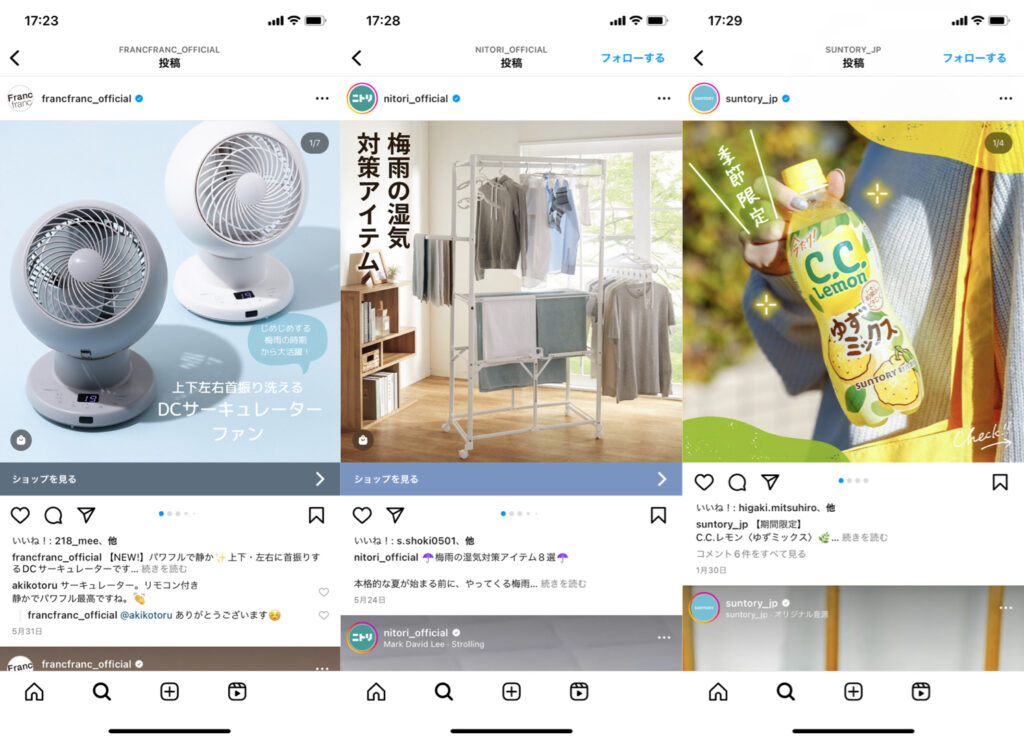
@nitori_official
@suntory_jp
Whether it’s a square or a vertical format, filling the entire space with text or design can make it difficult to read and unclear what the post is trying to convey.
While the desire to include as much information as possible or to create an eye-catching design is understandable, going overboard can have the opposite effect. Therefore, when creating a cover, be mindful of leaving some white space.
Introducing by Content! Recommended Catchphrases for Instagram Post (Covers)
When adding text to an Instagram post cover, it’s recommended to use a catchphrase that matches the content. Below, we introduce recommended catchphrases for different types of posts, so please consider them for reference.
Creating a Sense of Approachability: 「No More Worries!’」「Even Beginners Can Do It!」
If you want users who view your post to feel a sense of approachability, it’s effective to use catchphrases that resonate with your target audience. For example, for posts that compile information for beginners, phrases like「Even Beginners Can Do It!」 or 「Must-See for ◯◯ Beginners!」 are suitable.
By attaching a catchphrase that makes users think 「This is a post I should see」, increases the likelihood of them feeling a sense of approachability, making it easier to get likes or saves.
Posing a Problem: 「Could The Reason Be ◯◯?」 「◯◯ is NG!」
When posting content that raises a question or issue, it’s a good idea to use a related catchphrase on the cover. Phrases like 「Could The Reason Be ◯◯?」, 「◯◯ is NG!」, or 「Is ◯◯ Outdated?!」 can make the post more appealing to those who are troubled by that issue or seeking a solution.
Suggestion: 「Surprisingly Unknown」, 「Recommended: ◯◯!」
When making a suggestion through a post, it’s recommended to use a catchphrase that conveys to the user that there is beneficial information in the post. Specific examples include phrases like 「Surprisingly Unknown」, 「Recommended: ◯◯!」, and 「Do You Know This?」.
As an example, using 「Do You Know This?」 on the cover can attract users unfamiliar with the information to view the post. If the information proves beneficial, they might explore your other posts or follow your account, enhancing potential engagement.
Targeting: 「A Must-See for ◯◯ People!」, 「Key Points When Doing 〜」
If you have a clear target audience for your post, as with creating a sense of approachability, it’s recommended to use catchphrases tailored to that target. By doing so, it becomes easier for the target audience to feel that 「this post is meant for me」, which can lead to increased views and engagement. Specifically, using catchphrases like 「A Must-See for ◯◯ People!」 or 「For Those Who Want to Know the Key Points When Doing 〜」 can be effective.
Examples of What Not to Do for Instagram Post (Covers)

There are also some ‘no-go’ patterns for Instagram post covers.
Lacking Information Relevant to User Needs
Firstly, a cover lacking information relevant to user needs is a no-go! This is because it may lead users to conclude that 「the information I’m looking for is not in this post」, and they might not view it.
As an illustration, in posts featuring a restaurant, it’s advisable to mention 「the location of the shop (such as ◯◯ city)」 on the cover. Given that a significant number of users consider location a key factor in choosing a restaurant, providing this information on the cover can successfully meet their needs.
Poor Text Visibility
When adding text to a cover, enhancing its visibility is crucial. For instance, using text colors similar to the background, excessively small text, or too much text are no-gos! These can reduce visibility and may fail to catch the user’s eye.
Therefore, always be mindful of text visibility when designing your cover
Lack of Design Consistency
A cover that lacks design consistency, like using Gothic font for the main text but Arial font for the rest, is also a no-go. A poorly designed cover may fail to catch the user’s eye, resulting in the post being overlooked.
Therefore, while it’s not necessary to obsess over every detail, aim for a design that makes a good impression at first glance.
Use Graphic Editing Apps When Creating and Designing Instagram Post (Covers)
It’s recommended to use graphic editing apps for creating Instagram posts, including covers.
However, with the multitude of photo editing apps available, you might wonder, 「Which one should I use?」.
Below, we introduce two recommended graphic editing apps.
GoDaddy Studio(OVER)

If you’re having trouble deciding, we recommend using「GoDaddy Studio(OVER)」.
GoDaddy Studio is a graphic editing app that allows you to easily create sophisticated designs. It comes with a variety of stylish templates, making it user-friendly even for those who are not accustomed to creating posts. You can change colors, add photos and text, and make other customizations, enabling you to create posts with originality!
For more details about GoDaddy Studio (OVER), please refer to the following article. Be sure to check it out for a comprehensive overview.
Convenient for Creating Instagram Posts! The Graphic Editing App 「GoDaddy Studio(OVER)」
Promeo

Promeo is a graphic editing app that allows you to create images and videos with excellent design quality. It offers a multitude of sophisticated and user-friendly templates, making it perfect for creating covers and other posts!
It also provides a wide range of image editing tools, including stickers and filters. Additionally, you can add text or background music, enabling you to create impactful posts.
For more details about Promeo, please refer to the following article. Be sure to check it out for a comprehensive overview.
How to Use 「Promeo」, the Free App Convenient for Creating Instagram Posts
Creating Engaging Instagram Posts (Covers) to Capture User Interest
The cover of a feed post plays a crucial role in determining whether or not it will capture user interest. Therefore, if you’re focused on Instagram operations, we recommend creating posts based on the points introduced in this article. All these points are easy for beginners to adopt, so please consider them as references!
Moreover, creating and posting high-quality, effective covers is not the end of the process. By checking user responses to the post and implementing a PDCA cycle, you can improve your Instagram operations even further. Therefore, while focusing on post creation, it’s also crucial to pay attention to the analysis of your account!
For account analysis, we recommend using the Instagram-specific management system 「Slooooth」.
You can easily check various data related to your account and posts without having to verify them yourself. Additionally, since it retains past data, you can analyze the current state of your account and posts by comparing them with last year’s data. Take this opportunity to utilize it.


